Have you ever picked colors for a tufted rug, only to realize they don’t match as well as you thought? I made that mistake when I first started—my rug ended up looking like a chaotic mix of colors!
If you want to create beautiful, well-balanced color schemes for your tufting projects, this guide will help you understand color theory, choose the right palette, and avoid common mistakes.
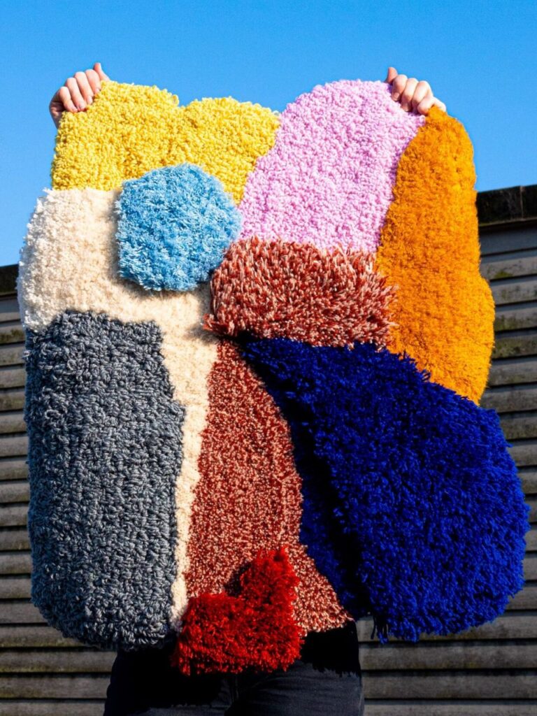
1️⃣ Understanding Basic Color Theory for Tufting
Before selecting colors for your tufting project, it’s important to understand how colors interact.
📌 Key Elements of a Good Color Scheme:
- Dominant Color: The main color that covers most of the rug.
- Accent Color: A secondary color that enhances the dominant color.
- Neutral Color: A background or balancing color to create harmony.
📌 Popular Color Schemes for Tufting Rugs:
| Color Scheme | Description | Best For |
|---|---|---|
| Monochromatic | Different shades of one color | Minimalist, modern rugs |
| Analogous | Colors next to each other on the color wheel | Natural, soft gradients |
| Complementary | Opposite colors on the color wheel (e.g., blue & orange) | High contrast, bold rugs |
| Triadic | Three evenly spaced colors on the color wheel | Balanced, vibrant designs |
| Neutral + Pop | A neutral base with one bright color as an accent | Stylish, timeless rugs |
💡 Takeaway: Choose a color scheme that fits your personal style and the purpose of the rug.
2️⃣ How to Choose the Right Colors for Your Tufted Rug
📌 Select Colors Based on the Rug’s Purpose:
✔️ For a Calm & Minimalist Look: Use neutral + monochromatic colors.
✔️ For a Bold & Vibrant Rug: Try complementary or triadic color schemes.
✔️ For a Soft & Natural Feel: Go with analogous colors like warm earth tones.
📌 Consider the Size of Your Rug:
- Large rugs → Should have more balanced, neutral tones.
- Small decorative rugs → Can have bold, artistic color choices.
💡 Pro Tip: Before tufting, create a digital mockup or place yarn samples next to each other to see how they interact.
3️⃣ Best Tools for Choosing Colors for Tufting
Not sure which colors work well together? Use these online color tools to generate perfect palettes:
🎨 Adobe Color (https://color.adobe.com) – Create color schemes based on the color wheel.
🖌️ Canva Color Palette Generator – Upload an image and get suggested colors.
🎭 Coolors.co – Generate randomized color palettes for inspiration.
💡 Pro Tip: If you find a color combination you love online, save the HEX codes to match them with your tufting yarn!
4️⃣ Common Mistakes When Choosing Colors (And How to Avoid Them!)
🚨 Mistake 1: Using Too Many Colors
- Problem: The rug looks cluttered and unfocused.
- ✅ Solution: Limit your palette to 3-5 colors for a clean and stylish look.
🚨 Mistake 2: Not Testing Colors Under Different Lighting
- Problem: Colors look different in daylight vs. indoor lighting.
- ✅ Solution: Test your yarn samples in various lighting conditions before tufting.
🚨 Mistake 3: Choosing Colors Randomly Without a Plan
- Problem: Colors may clash and ruin the design.
- ✅ Solution: Use a structured approach like color theory to plan ahead.
5️⃣ Final Tips for Stunning Color Combinations in Tufting
✔️ Follow color theory to create balanced, visually appealing rugs.
✔️ Choose colors based on purpose—soft, bold, or neutral designs.
✔️ Use digital tools to experiment with colors before tufting.
✔️ Test yarn colors under different lighting conditions to ensure accuracy.
Conclusion: Color is the Key to a Beautiful Tufted Rug!
Now that you understand color theory and how to apply it to tufting, you can create stunning, harmonious color combinations in your rugs.
Now, go choose your colors wisely and start tufting your masterpiece! 🚀✨